Styling Material 3 in Angular
Styling Angular 19 + Material 3 - getting light and dark themes to work
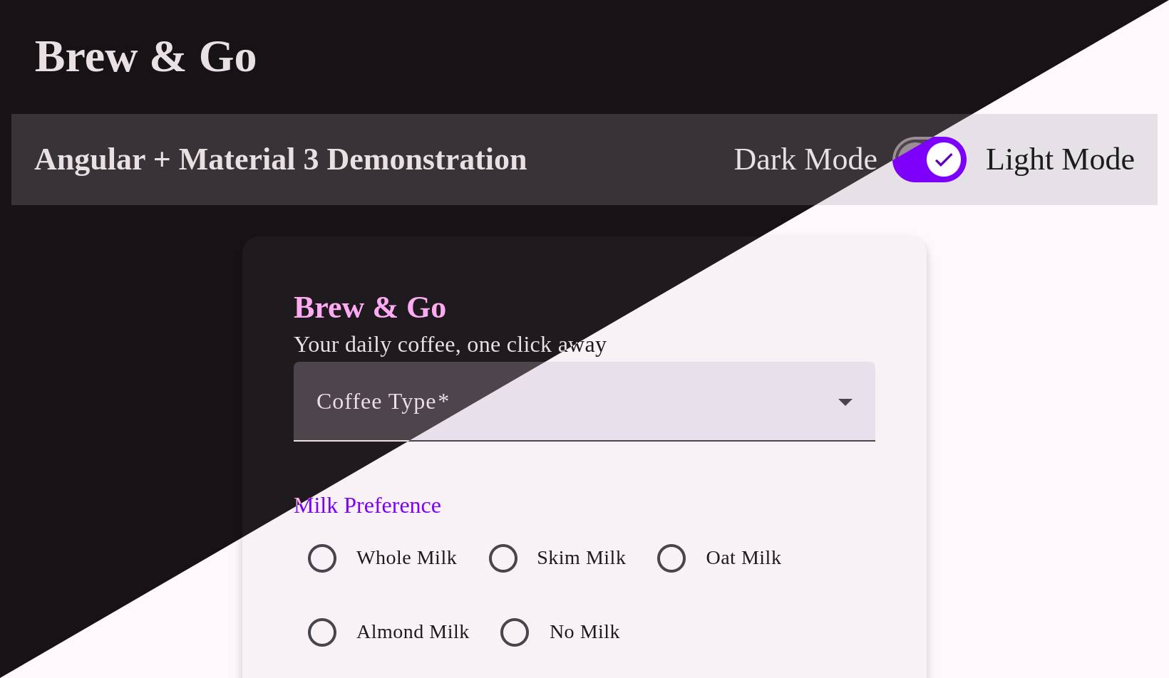
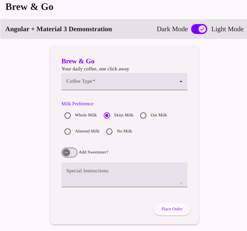
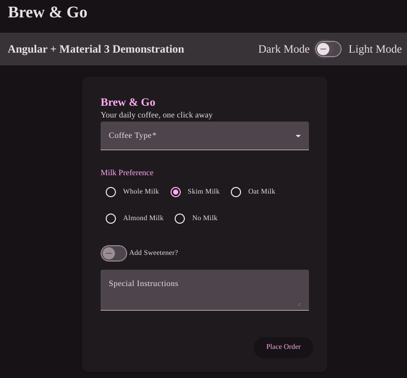
Angular Material has changed its theming API enough times to make you nervous about upgrades. From the classic Material 2 setup with two palettes and a handful of tokens, to today’s layered system in v19, it’s clear Google is pushing a more abstract design model. This post walks through setting up dark and light theme in a small coffee ordering form:
Material 2 vs. Material 3
Material 2 used to be simple: define primary, accent, warn, and you’re done. Everything mapped to those colors. Material 3 changes that. Instead of hard-coded color usage, it introduces roles—like surface, container, on-surface, inverse-primary.
You don’t ask “what color is this button?” You ask “what role does this button play in the UI?” Then Material assigns a tone from the palette to that role. Example:
background: linear-gradient(90deg, var(--mat-sys-surface-container-lowest), var(--mat-sys-surface-container-low));That’s not a design flourish—it’s how Material 3 expects you to define layered surfaces. Each layer (container-low, container-lowest) corresponds to a specific tone value from the system palette.
Light/Dark Theming with html[theme]
Material 19 supports multiple themes via CSS variables, which makes light/dark switching straightforward. Here’s how I structured mine in styles.scss:
@use '@angular/material' as mat;

html[theme='light'] {
  @include mat.theme((
    color: (
      primary: mat.$violet-palette,
      tertiary: mat.$orange-palette,
      theme-type: light
    ),
    typography: Roboto,
    density: 0,
  ));
}

html[theme='dark'] {
  @include mat.theme((
    color: (
      primary: mat.$violet-palette,
      tertiary: mat.$orange-palette,
      theme-type: dark
    ),
    typography: Roboto,
    density: 0,
  ));
}

body {
  background-color: var(--mat-sys-surface);
}
This setup gives you isolated themes keyed by the html[theme] attribute. You toggle it in your component like this:
get lightTheme(): boolean {
  return document.documentElement.getAttribute('theme') === 'light';
}

toggle() {
  document.documentElement.setAttribute(
    'theme',
    this.lightTheme ? 'dark' : 'light'
  );
}
And hook that into a UI toggle:
<mat-slide-toggle
  [checked]="lightTheme"
  (change)="toggle()"
></mat-slide-toggle>
You don’t need to re-render the app, recompile styles, or juggle classes. Just set the theme attribute and let the CSS variables do the rest.
Using Material’s Theme Engine Without Its Components
Even if you don’t use a single mat-button, you can still benefit from their theme logic. For example:
html {
  color-scheme: light dark;
  @include mat.theme((
    color: mat.$violet-palette,
    typography: Roboto,
    density: 0
  ));
}
This gives you access to the Material 3 token system—--mat-sys-surface, --mat-sys-primary, and others—so you can apply colors in your own components without writing your own color math.
Final Notes
Angular Material 19 isn’t just a new theme API—it’s a new mindset. Color values are out. Roles and tokens are in. That’s a good thing if you want consistency across components. But if you don’t want to use their components at all, you still have options.
Theming with CDK, SCSS, and just the Material token system keeps things clean, flexible, and future-proof (at least until the next API rewrite).
Project can be found here: Github